
Design Project: Urban Noir
This was an experiment in developing a coherent, modern magazine design from scratch: Urban Noir magazine, Issue 1 – September 2011. The magazine features model Molly Noelle Graham (MM#2218021). Hairstyles, makeup, and talent management were by Lara Graham. Photography, graphic design, and writing were by me. Thanks, Molly & Lara!

Essays & Commentary
FINDING NOIR
VANISHING POINT
TOUCH & FEEL
URBAN NOIR
Issue One * September 2011
Featuring
MOLLY NOELLE GRAHAM
A Walkabout Shoot
Philadelphia, Pennsylvania

FINDING NOIR
Film noir is often associated by American audiences with a particular look from American cinema in the 1940s. But, the look of noir has its roots in 1920s German Expressionism and selected work from 1920s German Cinema. German films from the 1920s with a strong Expressionist influence include The Cabinet of Dr. Caligari and Nosferatu, later, Metropolis and M. These films expressed their interiority through monumentalism and modernism on dreamlike, nightmarish sets. The films’ highly stylized looks—partially a result of the sets themselves but also largely due to deep lighting and disorienting framing—successfully externalized emotional intensity and nightmarish angst, lending deep exterior melodrama to their largely interior narratives. The cumulative effect is that the look of the sets is as much a character as the characters themselves. American filmmakers of 1940s film noir explicitly understood how this look enhanced narrative—a successful execution of noir’s look and feel is in the manifestation of an interior, psychological space that affects the external, visible world. How the film looks reflects a visual representation of how the director and cinematographer wanted to express the characters’ interior mindscapes. In less self-reflective work, the interplay of sets, light, and actors provided a dark, brooding mood against which the drama could play out. Urban Noir is what I want to get from street shooting. As I imagine it
continued on page 6
Caption: Model Molly Noelle Graham framed in reflected light on a granite textured background, solid and foregrounded, yet casting a distorted shadow, representative of an interior space.

FINDING NOIR (cont.)
An interplay of out-of-focus areas and selective light, plus a monochromatic color scheme, act as a counterpoint to Molly Noelle Graham’s performance, which illuminates an inner state of fragility and vulnerability.

FINDING NOIR (cont.)
and I practice it, Urban Noir is a style that draws upon elements of both German Expressionism and American Film Noir, but plays out on the street in found conditions, mise en scène, like the best street shooting. It pulls its noir influences from both look and mindscape considerations, it’s urban because of the locale and attitude. The look must include elements of monumentalism and modernism. Exploitation of directional light, shadows, and selective focus enhance the seen and also the unseen—the feeling that just out of frame a whole world is waiting, and perhaps not this one. Within the frame, a tension between the model and his or her environment is present—the model’s position interacts with the exterior spaces to reveal an interiority, something more about the mood.
From a practical standpoint, Urban Noir requires the photographer to visualize the final photographic possibilities of found spaces and light in otherwise “ordinary” street conditions. The street space must be photographed in such a way that it appears hyperreal—more real than real—or, an archetypical example of the street environment, heavily stylized through light and texture. But, the street could be anywhere in the industrialized world or nowhere at all, as on a film set. However, while the look draws from street conditions, the final photograph must draw out the interiority of the model’s performance by leveraging a sense of monumentalism and modernity from the environment. As a look, Urban Noir is characterized by a photograph visually and conceptually tied to the noir tradition, but practiced as a branch of constructed street photography.
Caption: Foregrounded, Molly Noelle Graham looks knowingly as she is embedded in a photograph that makes a conceptual nod to the golden patchwork paintings of Austrian painter Gustav Klimt.

VANISHING POINT
Simply, a “vanishing point” refers to when parallel lines visible in the image’s foreground run deep into the image’s background, appearing to converge at a single point. As there is always perspective in an image, every image will possess a vanishing point, even if the vanishing point falls outside the frame—it’s always in play, even if invisible. A related concept is that of “leading lines.” These are strong lines visible in the image’s composition that lead the eye through the image. In the cases where a vanishing point is visible, the leading lines often shoot through the image to converge
continued on page 9
Caption: The grid behind Molly Noelle Graham, coupled with an akimbo stance, short shadow, and leading, leaning lines, reveals an inner syncopation.
Caption: Pools of light reflected like dappled projections onto the gridded wall illuminate Molly Noelle Graham with a sense of mystery, the image’s vanishing point hidden out of frame and out of focus, the psychology of the model exposed as quiet confidence and interior poise.

VANISHING POINT (cont.)
in this single point. When the vanishing point is out-of-frame, often leading lines are still moving to the vanishing point, but they function in a two-dimensional fashion, flattening the image.
In many 1920s German Expressionist films—and later film noir works—the sets were manufactured with a strongly forced perspective, intentionally compressed to suggest paranoia, claustrophobia, and a heightened unreality. The compressed sets with their clearly artificial leading lines—and camera angles to accentuate the compression—were a staple of the look and genre.
I cannot build dramatic, forced-perspective sets in the city, but I can force the city into a dramatic perspective to frame my subject. If done correctly, the work accentuates and reveals architects’ unseen compositional grids that define the surface of the architecture—the unique fingerprint of the engineered, mathematical grid that each building possesses.
Through perspective, the photographs reveal the linear grids flowing through the architecture
continued on page 11
Caption: The vanishing point is behind Molly Noelle Graham: a semi-opaque reflected sky, revealing an opaque vision or dream behind the model, is sublimated.
Caption: Strong leading lines in the architecture—the wall and the skyscrapers—reveal and paint a grid that lead to Molly Noelle Graham, revealing a state of mind that is one half manufactured and gridded and one half featureless, smooth, waiting for the future that is unwritten—with an underlying, hidden rhythm.

VANISHING POINT (cont.)
and the overall composition—bringing strength and monumentalism into the frame. Planes and angles are always visible to the viewer but are often taken for granted. With Urban Noir, they are made visible, present, solid, real. In film noir style, the architecture can be made deeper, larger, and looming. Or, shallow and flat, depending on the psychological feel within the envisioned photograph. Successfully shot, the vanishing point and leading lines combine during the process of making the architecture and scene dramatic in a way that evokes a companion mood to the model’s performance, exteriorizing the interior landscape.
Urban Noir depends on the vanishing point—as much of noir does—to reveal a hidden urban landscape of grids and structures that wrap the model as much as his or her fashions, skin, and interior landscape.
Caption: A vanishing point out of frame, a plane pulling back and away from Molly Noelle Graham, the city is absent yet present in the shadows and painted light, motion delayed.
Caption: Framed in perspective, with shadows, concrete, and brick gridding the background, in full light but with the environment casting its own shadows, Molly Noelle Graham reveals a quiet waiting.

TOUCH & FEEL
In practice, textures and objects that create texture within the frame—and especially how those textures react to light—are a critical component of the street feel of Urban Noir. Without the textures of the city to anchor the look, the urban focus evaporates. A striking contrast—or striking harmony—is achieved when the model is framed against an appropriate, evocative surface, in a pool of light or, if the light is flat, with the surface’s texture or color.
The urban is necessarily defined by its textures: manufactured surfaces including steel, aluminum, iron, brass, stucco, concrete, cinder block, asphalt, travertine, marble, tile, glass, brick, and wood. These are punctuated by water and sky. Additionally, the level of decay, weathering, and moisture of any surface grants it a character, from grimy to pristine.
Caption: A rusted, double chain-link fence pulls Molly Noelle Graham forward, supported by the grit and hardness of asphalt, mirroring a hardness of character.
Caption: Shored up by rough cinder blocks and supported by cracked, stony concrete, Molly Noelle Graham’s silent defiance is framed.

TOUCH & FEEL (cont.)
Caption: Symmetrical cinder block patterns and weathered, asymmetrical wood planting boxes punctuating the rough, grey surface, reveal the stolid beauty of Molly Noelle Graham’s muted performance.

TOUCH & FEEL (cont.)
Not all surfaces are created equal—some can be leveraged to imbue the image with an appropriate Urban Noir feel, others not.
A staple of film noir is the use of large areas of shadow, concealing details while revealing others for a combined melodramatic and psychological impact. Textures are secondary in film noir, yet vital, as they catch or reflect the light to add depth or suggest a mood. Urban Noir reveals the model’s inner psychology partly through texture—glass and concrete for a hard, cold edge, asphalt and wood for a more organic, natural feel—yet still urban.
As a final point about the touch and feel of an Urban Noir photograph it is worth saying that in the absence of black and white film grain, the muted colors of the city, projected through their textures, surround and add to the model’s inner world as revealed in the image.
Caption: Thoughtful and posed before brilliantly reflective aluminum, strikingly positioned on stained white-painted concrete, or framed on golden stucco, Molly Noelle Graham’s inner states of mind are exposed through the touch and feel of her environment—from reflective to absorptive.

TOUCH & FEEL (cont.)
Caption: Weathered painted wood, rusted iron bars, a hint of concrete sidewalk—Molly Noelle Graham’s introspective mood is communicated through supporting textures.
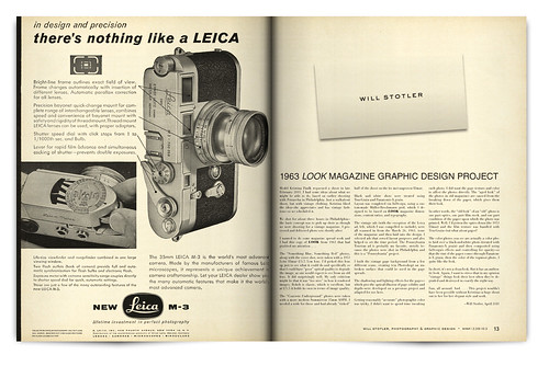
URBAN NOIR MAGAZINE GRAPHIC DESIGN PROJECT
They say that over time a photographer develops a style to his or her work that makes it recognizably his or hers. I’d been thinking for some time about what, exactly, my style of shooting is and how it works. With the development of this piece I think I’ve finally “found” mine: Urban Noir.
From a satisfaction point of view, it was pleasing to pull this magazine together. However, the writing was painful. The design itself, equally so. Several weeks of on-again, off-again work were required to work through the look, imagine how it should be, and try different approaches. While the end result is über-clean, it was painful to get the simple, uncluttered, content-focused clarity I wanted to draw from the photographs—without it being boring.
For the gearheads, the Müller-Brockmann grid underlying this piece’s elements was pulled from my PrettyPrettyRebel grid design, but adapted to full page spreads. The page lighting effects were tweaked further and surfaces refined. I’m finally satisfied with the look of the lighting. Typography was a challenge, and I kept it spare and strong with Twentieth Century, which was originally developed as a direct competitor to Futura. (To me, the geometric Futura promises a clean, bold future that never came to pass.) As always, development of all photos was in Aperture and layout was accomplished with InDesign.
Thanks are due to Molly Noelle Graham for her modeling talent, patience, and willingness to slog around Philadelphia and experiment until we could get each shot just right. Thanks are also due to Lara Graham, who provided dedication and time to enable the shoot for Molly. Without the day-of work (and later editorial input on photos) this final piece would not have been possible. Thanks Molly and Lara!
—Will Stotler, September 2011
Design Project: Vintage Pin-Up
Photos from a vintage clothing and cars shoot, July 2011, near Philadelphia, Pennsylvania. (See the full set of photos.)
The goal was to get a convincing pin-up look so that photos could be used in a vintage graphic design project.
I examined pin-up samples from the late 1940s through the early 1960s to get a feel for what they were and how they were used. Many of them incorporated a calendar. I decided that I’d make this project a “perpetual July” and shift the years–as a month-by-month calendar style was impossible.

Cover
Model is Molly Graham.
PINUP
JULY 2011
A VINTAGE CLOTHING PHOTOSHOOT
Molly Graham—1947 & 1957
Nicole Patrick—1951
Dannie O.—1952 & 1959
Bella Jade—1952
Jennie Cupcakes—1953
Christina Shaw—1955
Ashley Jensen—1955
Meredith Kimberley—2011
VINTAGE CLOTHING CURATOR
Kristina Paulk
EVENT COORDINATOR
Albert Heefner
PHOTOGRAPHY & DESIGN
Will Stotler
Model is Molly Graham.
MOLLY GRAHAM – 1947
Vintage sailor top and Navy skirt provided courtesy of Astro Vintage, Philadelphia. Photo above shot with a 1953 Leitz 5cm f/3.5 lens. Photo left and next page shot with a Cosina-Voigtländer Nokton 35mm lens at f/1.2 with a 6-stop ND filter. Both lenses were mounted on a Leica M8.


NICOLE PATRICK (MM#1952102) – 1951
Vintage pink plaid dress provided courtesy of Astro Vintage, Philadelphia. Photo above, left, and next page shot with a Cosina-Voigtländer Nokton 35mm lens at f/1.2 with a 6-stop ND filter, mounted on a Leica M8.


DANNIE O. (MM#877400) – 1952
Vintage front-pleat Capris with red trim provided courtesy of Astro Vintage, Philadelphia. Red top from collection of the model. Photo above and next page shot with a 1953 Leitz 5cm f/3.5 lens. Photo left shot with a Cosina-Voigtländer Nokton 35mm lens at f/1.2 with a 6-stop ND filter. Both lenses were mounted on a Leica M8.


BELLA JADE (MM#2104292) – 1952
Photo left, above, and next page shot with a Cosina-Voigtländer Nokton 35mm lens at f/1.2 with a 6-stop ND filter on a Leica M8.


JENNIE CUPCAKES (MM#2266581) – 1953
Reproduction Rockabilly dress courtesy of Vintage Beauty Clothing. Photo left and next page shot with a Leica Super-Elmar-M 18mm f/3.8 lens. Photo above shot with a Cosina-Voigtländer Nokton 35mm lens at f/1.2 with a 6-stop ND filter. Both lenses were mounted on a Leica M8.


CHRISTINA SHAW – 1955
Vintage mint green ruffle dress provided courtesy of Astro Vintage, Philadelphia. Photo above and left shot with a 1953 Leitz 5cm f/3.5 lens. Photo next page shot with a Cosina-Voigtländer Nokton 35mm lens at f/1.2 with a 6-stop ND filter. Both lenses were mounted on a Leica M8.


ASHLEY JENSEN (MM#1521232) – 1955
Vintage two-piece pink playsuit appears courtesy of Lauren Homer. Photo above shot with a 1953 Leitz 5cm f/3.5 lens. Photo left and next page shot with a Cosina-Voigtländer Nokton 35mm lens at f/1.2 with a 6-stop ND filter. Both lenses were mounted on a Leica M8.


MOLLY GRAHAM – 1957
Reproduction Monique Dress in Carnival Print from Heartbreaker Fashion. Photo left and above shot with a Cosina-Voigtländer Nokton 35mm lens at f/1.2 with a 6-stop ND filter. Photo next page shot with a 1953 Leitz 5cm f/3.5 lens. Lenses were mounted on a Leica M8.


DANNIE O. (MM#877400) – 1959
Vintage Kamehameha bathing suit appears courtesy of Astro Vintage, Philadelphia. Photo above shot with a 1953 Leitz 5cm f/3.5 lens. Photo left and next page shot with a Cosina-Voigtländer Nokton 35mm lens at f/1.2 with a 6-stop ND filter. Both lenses were mounted on a Leica M8.


MEREDITH KIMBERLEY (MM#96286) – 2011
Two-piece bikini supplied by the model. Harley Davidson motorcycle and shirt provided courtesy of the Aces & Eights Car Club. Photos shot with a Cosina-Voigtländer Nokton 35mm lens at f/1.2 with a 6-stop ND filter on a Leica M8.


VINTAGE PIN-UP DESIGN PROJECT

PIN-UP 1947 TO 1959 GRAPHIC DESIGN PROJECT
So what was the brief on this project? Shoot vintage clothing and shoot pin-up.
I examined pin-up samples from the late 1940s through the early 1960s to get a feel for what they were and how they were used. Many of them incorporated a calendar. I decided that I’d make this project a “perpetual July” and shift the years–as a month-by-month calendar style was impossible.
I shot at the event over the span of seven hours. The heat was intense and the venue was very tricky–it didn’t have the authentic flavor I wanted to get into the photos. However, I did find a way to make the project go–models plus vintage clothing plus some creative shooting and design work give this piece the proper, authentic flavor.
If you know me, you know I love tagging objects–nailing down information and details about things that appear in my photographs.
Here’s where I share that vintage clothing doesn’t reveal its secrets. For most vintage pieces, a rough date can be ascertained (thanks, Kristina), but tags are either missing or unreadable, making a full and careful catalog of the clothing impossible. Attribution is listed where it is known.
Of note, some of these photos were shot with a 1953 Leitz Elmar f/3.5 5cm lens. Others were shot with a Cosina-Voigtländer f/1.2 35mm Nokton. All were shot on the M8.
Photos were processed slightly yellow and very saturated. Then, copies were made and received a black-and-white treatment using TrueGrain and Panatomic-X grain. Layout and careful compositing was completed via InDesign, using a custom-made Müller-Brockmann grid, which I designed to be based on LOOK magazine dimensions, content ratios, and typography. This is likely the last time this grid and layout will be used.
The single most difficult challenge of this project was creating the custom calendars. Each calendar had to be laid out digit-by-digit, have its typography selected (period-authentic), and then be constructed. It was a lot of work.
It was fun selecting period-authentic typography for use throughout the project–the research on what to use was tricky, but in the end the look is there. In some places better than others. Of note, typographic design from these time periods is often “bland” and workmanlike. I attribute this largely to the print shop being responsible for the typesetting and using pre-made blanks.
Credit is due: I’d like to thank Albert Heefner for organizing this event and also Kristina Paulk for curating and managing the vintage wardrobe on set. Also, I’d like to thank each model that worked with me during the long day–without your work, these spreads wouldn’t have been possible. Most vintage clothing was provided by the Astro Vintage Boutique in Philadelphia, Pennsylvania. Thank you. The Aces & Eights classic car club brought vintage automobiles and the Nifty Fifty’s Diner was the venue–they also deserve a shout.
Again, thanks to all participants.
–Will Stotler, August 2011
Design Project: Dive
Design Project: Dive
Magazine spread graphic design project. Uses photos I shot while shooting the Leica M8 underwater with model Meredith Kimberly (MM#96286). Thanks, Meredith. (See the full set of photos.)
My design goal was to contextualize the underwater shoot and bring some meaning to the images via brief text and captioning. It was another opportunity to use the Müller-Brockman grid, while seeking a clean, modern look.

Cover
Dive
An Underwater Photoshoot
June 2011
Model
MEREDITH KIMBERLY
MM#96286
Photos, Writing,
& Design
WILL STOTLER
MM#1338163

FLOAT
The weightlessness of the underwater environment encourages photographs like this–free floating, as if in deepest space. Surrounded, for a moment, by blue void and tranquility. Unbroken silence. For a moment.

PUSH
A push through the water–leaving a trail of bubbles and churn, captured as glistening spheres, a cloud of motion-that-was. Up is down and down is up, the light playing on every trail left behind.

TRAVEL
The water’s surface, seen from beneath, is a mirror, trapping and reflecting light. Tilted, and working the angles, the surface becomes a wall of liquid, suspended in space before a traveler: a gateway to another world.

STILL
Captured breath, rising, and otherworldly hair playing in the void are the only hints of which way is up. Slow motion, frozen in time.
DIVE GRAPHIC DESIGN PROJECT
My interest in underwater shooting began near the end of the Summer of 2010: It started with a thread I wrote on the Leica User Forum asking if there were any way to shoot the M8 underwater–apart from spending eight thousand dollars on a custom-made housing, of which (I learned later) only 12 were made.
Comments ranged from “why would you want to use an M8 for that?” through to a few snide drive-bys. Apparently, it hadn’t been done.
Within a week or two, I acquired an EWA Marine U-F housing, which includes a built-in glove for focusing and adjusting camera settings. The housing is an industrial-grade plastic bag with a glass porthole in the front, rated to a depth of 33 feet. The M8 drops into the housing.
While running a few underwater tests, I discovered that the rangefinder (used to focus the camera) didn’t work in the bag. Framing was troublesome: The glass porthole and lens adaptor blocked about 60% of the viewfinder, which was troublesome to use underwater anyway because of distortion.
But, I got some interesting shots over a few days, the possibilities seemed bright, and we closed the pool for the season.
Enter early summer 2011 and model Meredith Kimberly. I had the pleasure of shooting very briefly with Meredith in February–but I’d seen her work. She had grit and, being trained for theatre, sweeping moves. So, I invited her to shoot underwater with the comment: “The shooting goal? Succeed.”
This set of underwater photos with Meredith is the two of us working with the medium: she explored weightlessness, fluidity, and the freedom to pose without regard to an “up” or a “down.”
The work itself was very tricky.
Light: Light was at a premium (we were shooting at night). I encountered the troublesome tradeoff of speed (usually 1/180th of a second) versus depth of field.
Depth of Field: These photos were all shot at f/2, which at a medium distance provides a foot-or-so of perceived “sharp enough.” But it’s not a lot to work with when you and the model are both drifting. Focusing was accomplished by measuring distance from camera to subject, prior to submerging, by 3.5 foot, 7 foot, and 15 foot pieces of string. Like this: Submerge and don’t shift distance forward or back. Additional light was added in some of the shots by free-handing a very strong diver’s light. This had mixed results. But I haven’t played with it enough yet. I have ideas.
Framing: Ah, framing. When 60% of your rangefinder is blocked there’s a lot of guessing about where your subject is. Especially when your subject is moving. Not to mention that the distortion renders a clear view troublesome, at best. (I’ve since worked out the framing problem by not using the included lens adaptors provided for the U-F housing–I have an acceptable 10% blockage now.)
I can’t stress enough that Meredith was an excellent sport and very collaborative when working to get a good performance. Repeated submerging. Treading water. (And not very warm water, at that.) Me: “I didn’t get it. Let’s do it again.” Meredith: “OK!” Thanks much!
As a parting shot, several folks online told me: “You’re doing this the hard way.”
Yes. I am doing this the hard way. Because doing things “the hard way” builds skills while leading to new ways of working and, often, new and interesting results.
–Will Stotler, July 2011
Design Project: Aqua Night
Aqua Night Magazine Graphic Design Project
This is another magazine spread graphic design project. The work uses photos I shot while attending Aqua Night, which was a fashion event focused on hairstyles hosted at the Walnut Room in Philadelphia, Pennsylvania. Thanks to all participants. (See the full set of photos.)
My goal was to further use the Müller-Brockman grid that I derived from a 1963 LOOK magazine, achieving a vintage look and feel from a modern setting, while giving selected shots from the event a context.

Cover
AQUA NIGHT
THE WALNUT ROOM, PHILADELPHIA
JUNE 2011
Hairstylist
BETHANY BELL
MM#1560482
Makeup Artist
MICHELLE RIVERA
MM Pending
Wardrobe Stylist
CANDACE WHALEY
MM#1003509
Event Coordinator
PHILLIP STOKES
MM#2172010
Photography, Writing,
& Graphic Design
WILL STOTLER
MM#1338163

Touchups & Adjustments
LEFT: Candace Whaley (wardrobe stylist) adjusts a design on Becca Morris (model).
ABOVE: Michelle Rivera (makeup artist) touches up lipstick for Becca Morris (model).
RIGHT: Michelle Rivera (makeup artist) finishes applying touchups for Sally Wong (model).

One Photo: Two Views
After looking at the work of hairstylist Bethany Bell, I thought the biggest challenge would be capturing the sculptural aspect of Bethany’s work. The weave and flow of the hair captures the light in particular ways and demonstrates interesting textures and forms. Models move—and different angles and sculptural aspects of the hairstyle are exposed as they move. This is part of the experience of seeing a hairstyle, its interplay with the model and the environment. Certainly, Bethany considers the hairstyle from all angles and designs her work so that it can be viewed—and reveals itself in stages—from any direction. Wanting to bring this experience into the photographs, I exploited a mirror that would show off the hair from two angles at once. The final lighting, through careful technique, appears as though it is mid-day, soft window light. This natural look accentuates the curves, soft shadows, and intricate weaving. I think Bethany’s work looks great in this light—I hope you do, too.
MODEL: AQUASIA DAVIS (MM#2222579)
MODEL: JASMINE BEATTY (MM# PENDING)
MODEL: SALLY WONG (MM# PENDING)
MODEL: BEKA JAYNE ARTHUR (MM# PENDING)

MODEL: JORDANA JAGDEO (MM#1198372)
MODEL: BECCA MORRIS (MM#2237157)
MODEL: WHITNEY STAR (MM#1117984)

Aqua Night Graphic Design Project
I was invited to Aqua Night, an event that focused on fantasy, fashion hairstyles. The event was hosted at the Walnut Room, a lounge/club in Philadelphia.
I figured it would be fairly dark, so I decided to shoot with my CV 35mm f/1.2 lens—bringing my SF-24D flash (and sync cord) along, just in case it would be needed.
I arrived at the event start time—meaning two-and-a-half hours early—and took time to inventory possible shooting scenarios: Places to shoot and also lighting conditions. Ambient light was poor, averaging an EV of 2 or 3 at ISO 320.
Pre-event, the models staged in a side alcove downstairs—I shot a bit of this area and the models getting touchups and wardrobe adjustments. I also dug out the flash—even f/1.2 wasn’t enough to overcome the lack of light.
The event itself, including a fast runway walk to show off the styles, happened in the main Walnut Room lounge. I elected to not shoot the runway work because I didn’t like the clutter in the frame—any shots I took wouldn’t convincingly look like runway.
That left post-event portraiture. However, conditions for portraiture were problematic because of the event’s guests being, well, guests—wandering in and out of frame. However, I’d scouted the unused forward lounge area. It was unoccupied, had a gigantic mirror, and was perfect for a “show the hair from the front and the back at the same time” concept. So I settled on that. (BTW, thanks, Phillip, for directing models forward to the shooting area I’d selected.)
I shot for about 25 minutes. Light was put into the scene by a hand-held, off-camera flash, which I bounced off of the bank of windows, camera left. Intensity and direction of light was controlled by pivoting the flash in my hand, shooting a test, and then refining angle. TTL mode was used to balance the scene’s light. The models were patient throughout the process—I had about 120 seconds, give or take, with each model and pair of models.
This set was really screaming at me for context—so I decided to select a few key photos to get at the concept of the shooting and then make this spread.
Layout of this spread was completed via InDesign, using a custom-made Müller-Brockmann grid, which I had designed to be based on LOOK magazine dimensions, content ratios, and typography. It was a carry-over from my previous LOOK magazine project work—I’m not yet done with this kind of grid and look. One more chance to learn.
I built the vintage page background from a few different scans, creating (via Photoshop) an unbroken surface that could be used in the page spreads. The shadowing and lighting effects for the pages—which give the optical illusion of page solidity and depth—were developed on a previous project and further adapted for use here.
Black and white shots were treated using TrueGrain and Tri-X Pan grain, with filters as needed to bump intensity/density of luminosity.
Color photos were treated by using a layering effect in InDesign, compositing the color photo over Tri-X Pan treated black-and-white versions of the same photos. This layering of photos—provided the balance of the compositing is correct—emulates the tonality and “color character” of 1960s film stock, as displayed on vintage paper.
Last, this project wouldn’t have been possible without the work of everyone who made the event a success—hairstylist, makeup artist, wardrobe stylist, event organizers, all the models, and a general community effort. Well done, worth shooting.
—Will Stotler, June 2011
MODELS:
SELINA NICOLE CLIETTE (MM# PENDING)
AQUASIA DAVIS (MM#2222579)
Downloads
Links to PDFs are provided below. These can be opened using the free Adobe Acrobat Reader. NOTE: It is recomended that you “right-click save-as” the files to your computer, then open them there.
Design Project: 1963 LOOK
1963 LOOK Magazine Graphic Design Project
Model Kristina Paulk requested a shoot in late February 2011. I had some ideas about what we might be able to do, based on earlier shooting with Petrarcha in Philadelphia. Just a walkabout shoot, but with vintage clothing. Kristina liked the idea—she appreciates and has vintage fashions—so we scheduled it.
We shot for about three hours in Philadelphia—the basic concept was to pick up shots as though we were shooting for a vintage magazine. I processed and delivered photo sets shortly after.
I wanted to do some magazine spread work and I had this copy of LOOK from 1963 that had grabbed my attention. . . .

Concrete Underground
When Kristina met me in Philadelphia for the shoot she was wearing this dress. And I had her change out of it because it didn’t strike me as being particularly vintage—and, I wasn’t sure what to do with it photographically. I did promise her, though, that we’d shoot with it last so I’d have time to think about how to use it in a scene and pick up a vintage look with it. While Kristina was changing out of the dress I had time to look around and start thinking about it. I had a solution. The dress, evocative of the 1960s, was part of a future that never happened.

J.G. Ballard gets at this concept in his work from the early 1960s: The atomic age is as much about the artifacts in concrete that are littering the landscape, the cradles of a future that has seemingly moved on without us. The structures being the only remaining objects, reminders, sentinels, warnings. I was also thinking about the ‘64/’65 Worlds Fair in New York City. The future was a marketing ploy—an imagined space where corporations had a vital (and continuing) role to play in shaping how we live. They were serving up the promise of a better life. As though the technology would solve the all-too-human problems of the present.
The building material of choice was concrete. Plastic final forms made from liquid stone and left behind to decay. It was the future when they made it—and their work then serves as a reminder now that we’re in the future, but this vision of the future is from the past. And we’re still stuck with it. For good or ill.

In any case, this is what I was thinking about when preparing to shoot Kristina in this dress: How to effectively capture the promise architects and workmen cast into their concrete structures—and the decay of that promise.
I’d shot near the subway at City Hall in the past with Atul Narula—an accident, really. The time-period of the look was right for the early 60s. So was Kristina’s dress. So, why not?
Almost half of the photoshoot’s photographs came from the shoot with this dress and in this environment. Kristina was on her game, I’d like to think I was on mine, and something was just clicking.

I can say that going into this phase of the shoot I was unsure of whether or not I’d “gotten it” earlier in terms of the shots. (I had, but I was unsure.) It was largely uncertainty about using a 50mm focal length with tighter framing (I normally use a 35mm focal length in the city), trying to put into practice lessons I’d learned during the “Shooting Six” shoot from February (in terms of composition), and a bit of worry that the Elmar 5cm lens from 1953 wouldn’t give me results I could actually use—I’d never used it for this kind of shooting before.
But, conceptually—and with the swap to the 35mm focal length—I got more comfortable. And the architecture was positively humming with “future promised but not delivered.”
Kristina met the task. She matched her performance to the scale of her surroundings. Whether this was conscious or unconscious, I don’t know, but I’d like to credit her with working well in her surroundings to nail the look.
Well done, Kristina. And the future is concrete.
Something Blue, Something Red
During the shoot in Philadelphia, I wanted to work closely with Kristina to use texture and color as backdrops for her vintage looks.
As I said to Kristina—and as I was discovering myself—the more I shoot the less interesting most backdrops and backgrounds become. I’ve shot so many photographs now that I want interesting things, in terms of texture, color, how the light falls on the object, etc.
For this dress, I wanted good, interesting light, and color to set it off.

We shot with backdrops of stone, brick, the shiny red tile (above), and the degraded and decayed blue paint (left).
I stressed backgrounds when working with Kristina and she had said at one point: “I’ll get a lot of photos with great backgrounds.” She did.
In my opinion, the backdrop is the most underestimated object in most photography. The way a surface appears, the way it feels, the way the color will render—or how the texture will pop in a black and white treatment—are often overlooked. Or, just ignored.
The subject is the whole photograph. The backgrounds are a critical part of the whole thing.

Backgrounds, through framing and careful selection of color, accentuate the point of focus in the photo—and an interplay between the point of focus and the background are critical to establish mood, tone, time period, and a general aesthetic.
Great backgrounds can be pulled out of just about anywhere—you work with what you have. The camera is as dumb as a brick, having no sense of time, place, or space. With something interesting to frame up your point of focus—in this case, Kristina and her vintage fashions—the negative space isn’t just there, it helps to make the final photograph work well.
Lenses
The “Something Blue, Something Red” photos, along with the cover shot, were taken with a 1953 Leitz Elmar f/3.5 5cm lens. I’d picked this lens up just to see what it could do and specifically so that I could have “poor” optical quality to degrade the image, as one would expect to see from an old lens. It did surprisingly well. My only criticism might be that it was “too nice” in how it rendered images. Bokeh is classic, which is excellent, but at f/3.5 it holds its own in terms of image quality.
The “Concrete Underground” photos were taken with a more modern Summicron 35mm ASPH. I needed a wide for those and had already “risked” half of the shoot on the (to me) unproven Elmar.
Black and White
Black and white shots were treated using TrueGrain and Panatomic-X grain.
Layout was completed via InDesign, using a custom-made Müller-Brockmann grid, which I designed to be based on LOOK magazine dimensions, content ratios, and typography.
Vintage Ads
The vintage ads (with the exception of the Leica ad, left, which I was compelled to include), were all scanned in from the March 26, 1963, issue of the magazine and then laid into the design. I selected ads that served layout purposes and also helped to set the time period. The Pennsylvania Tourism ad is probably my favorite, strictly because the photos were shot in Philadelphia and this is a “Pennsylvania” project.
Backgrounds and Page Depth
I built the vintage page background from a few different scans, creating (via Photoshop) an unbroken surface that could be used in the page spreads.
The shadowing and lighting effects for the pages—which give the optical illusion of page solidity and depth—were developed on a previous project and adapted for use here.
Handling Color
Getting reasonably “accurate” photographic color was tricky. I didn’t want to spend time tweaking each photo. I did want the page texture and color to affect the photos directly. The “aged look” of the photos in old magazines are caused from the breaking down of the paper, which gives them their look.
In other words, the “old look” of an “old” photo is one part optics, one part film stock, and one part condition of the paper upon which the photo was printed. Well, I’d gotten the optics down (the 1953 Elmar) and the film texture was handled with TrueGrain—but what about paper?
The color photos you see are actually a color photo laid over a black-and-white photo (treated with Panatomic-X grain)and then composited using InDesign’s effects and controlling for opacity—so that the tint of the paper comes through Panatomic-X grain, then the color of the topmost photo. I quite like the look.
In short, it’s not a clean look. But it has an authentic look. Again, I want to stress that in my opinion “vintage” things look their best when they’re degraded and destroyed in exactly the right way.
Fun and Thanks
Fun, all around. And. . . . This project wouldn’t have been possible without Kristina—a huge shout out to her for her elegant style and work.
Shooting Six: A Model Shoot
Summary
Sunday, February 27th, I had the pleasure of shooting with six models, a fashion designer, and a fellow photographer—to a killer shoot soundtrack—at Studio on Market in Wilmington, Delaware.
See the “Shooting Six” Set on Flickr
It was my largest self-organized photoshoot to date—and, like my other shoots, this was a TFCD shoot. Everyone pulled together to make it a success. Thanks to everyone that contributed, as without your work, the shoot wouldn’t have been possible.


Kickoff
This shoot started as a request from a workshop attendee, photographer Brian Bailey, who wanted to know significantly more about how to handle lighting. Brian is largely shooting sporting events but had an interest in more technical studio work. (His Website is GetShotByBrian.com.) His request couldn’t be accommodated in a workshop format—the hands-on component of working with lights to get it “just right” was more than that format allows. So I said: “What do you think about splitting the cost of studio space?” He agreed, and then I started to pull everything together.


Logistics
First, I secured space. Locking in the location first was critical—without a firm location, sending invitations to models would have been impossible. The team at the clean, new Studio On Market, in Wilmington, Delaware, were very helpful and had Sunday, February 27th available. (I’d recommend them.) I booked with them after inspecting the space, which was perfect for the size and nature of the shoot.
Next, I started securing models. I did this by posting a Casting Call on ModelMayhem and then following up with models local to the Wilmington area to see if they had interest. Follow-ups and questions were answered in a timely manner and models were booked.
Then, one week before the shoot, it became apparent that I’d have between 5 and 8 models attending.
After conversation, Wilmington fashion designer and artist T.Saph stepped up to support the event with her fashion line and designs.
As the shoot had developed momentum, I also reached out to Josh Harnois. He is a classically trained musician, producer and DJ currently residing in Washington, D.C. (I shot Josh for his personal marketing material the year before.) I needed a soundtrack for the shoot and I wanted him to do it because he understood all aspects of what was needed: scoring music for film, modeling, appropriate attitude, photoshooting, and the attendee demographic. Of course, Josh nailed the work.
So, I had a date, studio space, likely 6 models attending, a fashion designer with clothing, a soundtrack, and a fellow photographer to assist/train. After taking a deep breath, I started to plan.


Preparation
Going into a shoot this large would have been a disaster without planning and goals. Based on the studio space, training I’d need to do with Brian on the lighting, and individual model needs, I decided to focus on beauty/commercial shooting.
Here were the prep items:
- I needed to settle on a range of looks, based on a “commonly accepted” beauty/fashion look. I consulted with a colleague of mine, graphic designer J.C. I posed the question: “In your opinion, what are the top three beauty/fashion magazines read by the 18 to 24 female demographic?” She identified Cosmopoliton, Glamour, and Elle, in that order.
- I purchased a copy of each magazine. Then, I carefully removed any page from each magazine that was shot in-studio. I explicitly did not censor anything out based on my taste. If it was shot in-studio, I pulled the page. This was important so that a full range of looks could be gathered for analysis.
- A stack of loose pages was useless, so I created a modeling analysis book, where I pasted in every page (and double-page spread) that was relevant, leaving a facing page for notes.
- I analyzed each page, determining lighting setups (shadows, level of fill, modeling light, soft/hard, etc.), framing, apparent focal length, f-stop (for DOF), text placement, and intended purpose of the advertisement or photo. For the modeling work, I got a feel for expression, hand placement, dynamic vs. static body positioning, and overall “feel” from each piece. I also identified where the Photoshop work was—to my disappointment, a significant amount of the Photoshop work in ads was readily apparent due to hasty execution. (If you’re going to do it, follow through, please. I shouldn’t see it.) IMO, Elle had the best straight-photography work.
- I circled back around with J.C. and had her take a look at the modeling analysis book. Based on watching her examine the book and verbally confirming conclusions, I got two takeaways: (A) Order of viewing a page’s content is: Clothing, Makeup/Hair, then Model. If close up, Makeup/Hair, then Model. If clothing/makeup/hair are not strong or not of interest, it’s all about the Model. (B) If the ad is about clothing, the clothing must “wear” the model. Or, if the ad is about makeup, the makeup must “wear” the model. The lighting, framing, pose, and facial expression accentuate acceptance of both A and B.
- Working with some past photography as a basis, I laid out mock magazine spreads, including text placement, to better understand the underlying composition and grid structure that was in use. Understanding more about that would help me frame and get what I needed day of shoot.
- I tested lighting setups and positioning to ensure I could get what I needed on set, prior to shooting. I determined that a two-umbrella setup, with a small softbox, would get me where I would need to go.
- Working through the mental geometry of getting models into the setups—based on planning to exploit the studio’s strengths—was the most difficult part. How would I manage eight people in the studio space and lighting setups during the day of shooting? To guarantee I could “get” it? I worked out three or four different workflows, building in failure points, and geared my goals appropriately.


Goals
Based on pre-planning, the shooting goals were aggressive:
- Provide a professional tone and good working environment.
- Each model had to take away at least 5 shots from at least two shooting sets that were technically on par with work in Cosmopolitan, Glamour, or Elle from a technical/lighting/framing perspective.
- Each model had to be given time to work and get comfortable so we could “get” it.
- Each model had to work with at least one other model in a shot—a “pair” shot.
- Each model had to have a a range of closeups, two-thirds, and full-body shots.
- Each model would model in at least two outfits.
- Each model would model in at least one outfit provided by T.Saph.
- No model could “sit” idly and un-utilized for any length of time.
- Models would work together—more-experienced models would be encouraged to mentor and work with less-experienced models, providing experience for both of them.
- Lighting would be continually adjusted to capture the framing, then mood, then accentuate the pose and clothing.
- Brian Bailey (photographer) would be briefed on lighting, posing, and other shoot aspects throughout and continuously.
- T.Saph (fashion designer) would be given the opportunity to match her clothing line to the models as she saw fit—to pick up appropriate and useful looks for her needs.
- Keep the shoot to no more than four hours in length—one hour of test shots and two-and-a-half hours of work, once everyone was settled in.
- Not piss anybody off. More important, send everyone home satisfied with the experience and excellent photography.
- Strictly adhere to my 10 Guidelines for Shooting.


Credits
Cast
Claire Franklin (MM#1403466)
Dana1020 (MM#1510813)
Amanda Whelan (MM#1752316)
Ivory (MM#1929042)
Minuette Kalia (MM#1958191)
Angel (MM#2014214)
Crew
Lead Photographer – Will Stotler (MM#1338163)
Associate Photographer – Brian Bailey (GetShotByBrian.com)
Clothing Designer – T.Saph (MM#1892259)
Shoot Soundtrack Designer – Joshua Harnois (MM#1500956)
Location
Studio on Market – 219 Market Street, Wilmington, DE 19801
Previsualization: Case Study
I was approached by Nick LaBella, a model I had shot earlier in the year, to do some “fall shooting.” Nick was looking for updates to his port along the lines of men’s fashion. Based on Nick’s look, I decided to contact Amber C., another model I had shot previously in the year, who had demonstrated action attitude. She agreed.

I had two models with which to work, both of which had strong looks and willingness to work a scene. Well, now what? I had been wanting to do an “action shoot” for some time and figured: “This is it.” So, I spoke with both models and they agreed to do action shooting in addition to “standard” fall fashion portfolio work—and to bring black “Matrix-like” clothing to the shoot.
Two models. Ready to shoot action. Well, let’s not waste the opportunity through a lack of planning, eh?
I decided to keep the action shooting small and doable. To generate ideas and get a good view of what the final product might be, I knew I’d need to do previsualization (“previz”) so I could think about story. Without story—at least in the flow of images—I’d have nothing. I grabbed my 5-volume set of Vertigo’s The Losers off of my shelf and started to flip through. Most of it wasn’t useful for my purposes, but there were individual shots I really liked. So, I stayed away from storyline and looked strictly at the layout of panels, the positioning of characters in the individual panels, and the use of angle/distance to convey mood and action.
In the end, I scanned in about 12 pages from the whole set and swapped them around, using a page-level cut-up technique, and settled on a flow of six pages, the first and last being “signature” looks, and the four pages in-between conveying a rough flow of action. The key to this process was to find pages and panels that would convey a scene—completely divorced from the characters that appear on those pages and panels.
The final, rough version of the previz, looked like this:

For story, I settled on a confrontation between a courier (with a Haliburton Zero briefcase)—played by Nick—and a contracted assassin who wanted to steal the briefcase—played by Amber.
What I needed for Amber was a gun. I tossed around the idea of having her use a Glock. But it wasn’t enough. Based on Amber’s presence, I needed big, unreal, badass-looking guns.
So . . . . I prepped up the guns and went off to the shoot.
Results from the shoot can be seen below.
NO I didn’t get something as stylish as what I wanted, but I did get lots of practice with linear narrative. And Amber and Nick had fun. So, win-win.
Page 1

Page 2

Page 3

Page 4

Page 5

Page 6


Design Project: EA Effect Look Book
Some Notes on This Project
I recently finished a Look Book graphic design project for EA Effect Boutique‘s Fall/Winter 2011 line. Looks and makeup are by designers Ella Kolanowska (Pearl in Crown) and Anya Payne (Independent Flavor). The model is Julie Hoxie. Photography and graphic design by me.
The project’s first goal was to shoot Julie in looks from Ella and Anya in a single afternoon, working shot-by-shot to match varied Philadelphia environments with the feel of each look. The project’s second goal was to create a convincing, press-ready Look Book, based on the client’s selections of shoot photos. The project’s third goal was to experiment with brand development: developing and packaging a concept that credibly defines the look of the EA Effect brand.
Cover
LOOK BOOK
FALL/WINTER 2011
EA EFFECT
Inside Cover and Page 1
Fashion Looks
EA Effect Boutique
Labels
Independent Flavor
Pearl in Crown
Model
Julie Hoxie
Photography and Graphic Design
Will Stotler
Pages 2 and 3
Independent Flavor
a. Grey and red hand-knitted sweater with open back
b. Jasper necklaces
c. Knitted necklace with chains and suede
d. Bracelets
e. Semi-precious stone and chiffon
EA Effect Boutique
1. Fur hat by Quarz
2. Braided scarf
Pages 4 and 5
Independent Flavor
a. Black and grey hand-knitted oversized sweater
b. Mixed-media necklaces
c. Hand-knitted party scarf with vintage pearls
EA Effect Boutique
1. Faux fur leg warmers by Quarz
2. Fur hat by Quarz
Pages 6 and 7
Independent Flavor
a. Hand-painted tunic
b. Necklaces
EA Effect Boutique
1. Fur scarf
2. Hand-made gloves
Pages 8 and 9
Independent Flavor
a. Hand-knitted sweater
b. Necklaces
EA Effect Boutique
1. Fur scarf
Pages 10 and 11
Pearl in Crown
a. Velvet, crocheted dress
b. Wooden, tassel necklace
EA Effect Boutique
1. Fur hat by Quarz
Pages 12 and 13
Pearl in Crown
a. Hand-painted t-shirt
b. Crocheted necklace and braclet with lapis lazuli stones
Independent Flavor
1. Jeans shorts
Pages 14 and 15
Pearl in Crown
a. Hand-painted tunic and jacket
b. Fringe pendant necklace, knitted rope
EA Effect Boutique
1. Fur hat by Quarz
2. Hand bag by Elizavieta Meskin
Pages 16 and 17
Pearl in Crown
a. Hand-painted sweater
b. Tassel necklace & different shapes, agate with gold chain
EA Effect Boutique
1. Faux fur leg warmers by Quarz
2. Leggins by Elizavieta Meskin
Pages 18 and 19
POSTER CONCEPTS
Pages 20 and 21
Pages 22 and 23
Pages 24 and 25
Page 26 and Inside Back Cover
EA EFFECT BOUTIQUE LOOK BOOK GRAPHIC DESIGN PROJECT
This look book’s concept and design is likely overkill for a boutique in the Philadelphia marketspace, but appropriate for a boutique in London, New York, or Los Angeles. Well, why not think big?
The project started in conversations with fashion designers Ella Kolanowska and Anya Payne. Ella and Anya own and operate the EA Effect Boutique (they are the “E” and “A” in the boutique’s name). Each designer has her own clothing and jewelry lines under the EA Effect umbrella: Ella has Pearl in Crown and Anya has Independent Flavor.
After a June meeting, Ella and Anya agreed to a city-look shoot for the EA Effect brand, provided the urban look wasn’t sleek with glass and steel and concrete. They wanted their brand to be surrounded by earthy textures, a bit of nature, and “colors.” I agreed to pull that look out of the city, which is a challenge. Ella and Anya selected the model to represent their brands’ looks: Julie Hoxie. Julie is a new model–professionally, she’s a pattern designer for the fashion industry–and a natural.
Time was very tight during the shoot in October. The original plan called for shooting eight looks from each designer–I was able to pull eight looks, total. Ella and Anya are “we know what we want when we see it” clients. This means that a range of photographic concepts had to be shot so Ella and Anya could decide on just the “right” look to represent their brands. This meant I needed to shoot between 7 to 9 “mini-sessions” per ensemble. All told, this added up to over sixty “mini-shoots” in a single afternoon. Each of the “mini-shoots” was in a different location I selected on-the-fly for color, texture, and feel to compliment the look Ella and Anya had selected for Julie. I worked with Julie in each location to get performances that could compliment both the environment and the fashion. In the end, Ella and Anya were able to pull together what they wanted based on the wide range of options they received. So, I consider this approach very successful.
Structurally, the look book uses a modified grid structure, with a vibrant tangerine color to compliment the EA Effect logotype. The mood of the book is design-forward, with a simplicity and order that compliments the organic and earthy tones/settings found in the photography. Each piece in the look book is handled as a unique item deserving of indexing and explanation–from the photography through to the design. As an aggregate, it’s clear there’s a collection here with a unified driving concept–from the ensembles through to the environment, to include Julie’s modeling performances. Eight final looks and also six EA Effect poster concepts are included, as I was thinking about this project from a fashion marketing campaign perspective.
I’d like to again thank Ella, Anya, and Julie for their work on this project. Well done–good learning experience.
–Will Stotler, December 2011
See the Full Set
See this Look Book in a slideshow.
See more in the EA Effect Fashion Shoot set.
December 31, 2011 | Categories: Commentary, Design, Photography | Leave a comment