Post-Processing: Development Study 1
Roughly 90% of my photos’ “look” is manufactured by exploiting on-location light and capturing it, while only 10% of the “look” is manufactured with post-production work.
This post is about the “10%” involved with manufacturing a “look” during my post-production workflow—digital development of a thoughtfully shot scene.
Shooting On Location To Get A “Look”
The shoot with model Petrarcha (ModelMayhem #1218983) was an intentional attempt to get a contrasty, vintage look out of Philadelphia backdrops and period clothing.

I scheduled the shoot for the late afternoon and early evening to get this specific kind of light. Additionally, I hunted backdrops while working that would accentuate Petrarcha’s look and also have interesting light effects on their surfaces. How boring is a brick wall? Pretty damn boring. But, very interesting with the right light to give it a golden hue, interesting shadows, and when it complimented Petrarcha’s period look.
A high-contrast, period look can be gotten by using very contrasty light and then deliberately under-exposing the contrasty scene to save highlights and drop most of the frame into shadow or dimly lit backdrops. I will shoot this way because I know I can “bring up” the backgrounds in post. (Or hide them more, depending on the shot.) But I can never save the highlights if I “blow” them out. They’re just gone. The image for this Study has borderline blown highlights, which was by design.
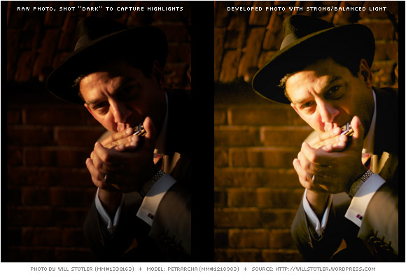
The RAW photo below was shot at 1/4000th of a second at f/1.2, with an ISO of 160 and white balance set to daylight. This captured the highlights, dropped the rest into darkness, and pushed the color of the photo toward a warm, golden hue as the white balance is (from a technical perspective) incorrect. Shooting at ISO 160 ensured that plenty of shadow detail data would be available for tweaking in post.
So, looking at the underexposed image on the left—which is not really underexposed, but exposed to preserve the highlights—and then the final image on the right, you can see how it’s possible to shoot in light like this and “save” the photo as a shooting strategy. Details on how to do it are below.
Step 1 – Hot/Cold Areas Turned On
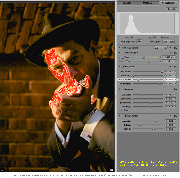
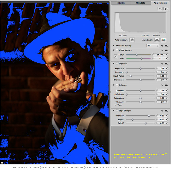 I always look at an image when I’m working with my “hot” and “cold” areas turned on. Red areas represent “blown” highlights (shown on the right of the histogram). Blue areas represent “lost” areas of shadow that have gone completely black (shown on the left of the histogram). Most normal images need to have near zero blown highlights (red areas), except for bright sparkly light reflected from, for example, water, eyeballs, or shiny objects. Likewise, “lost” areas of black should be slight, although it is more acceptable to lose shadow blacks for effect.
Step 2 – Bump Exposure
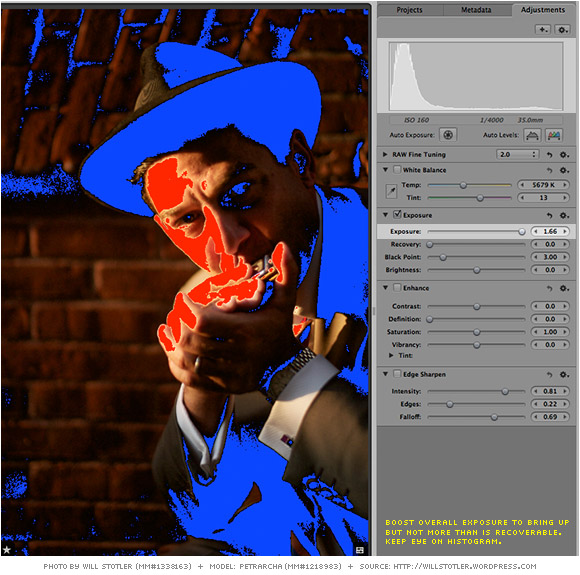
Here I’ve dialed up my exposure dramatically to bring up detail in the foreground and background. The red areas can be recovered. What you can’t see in this image is that I bumped Exposure, then Recovery, and played with the sliders a bit to make sure I’d be able to Recover my highlights later.
Step 3 – Too Bright? Dump Some Contrast
After playing with the relationship between Exposure and Recovery, I determined that the photo would be “too hot” with its current level of Contrast. So, I dialed that down. The problem is that when you dial down Contrast you solve one problem (blowing out highlights vs. overall Exposure) but create another: a “flat” image. So. . . .
Step 4 – Bump Saturation & Bump Vibrancy
To start to deal with the problem of the lost contrast, I bumped the Saturation and Vibrancy—quite a lot, actually. This was to dump some color into the photo and bring out the golden hues. (Remember: I shot with a regular white balance at the end of the day, which means the white balance tends to be warmer than “technically correct.”) This, in turn, made the area that will have to be Recovered larger. No problem.
Step 5 – Bump Brightness
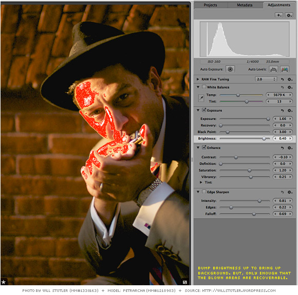
To better match the very bright areas of the photo with what could be “blown” highlights—and also to really bring up the background—I bumped up the brightness. Brightness has a color-killing effect, though—using Brightness can suck the life out a photo. But, we’re OK because the lightness of the skin tones came up to be closer in brightness to areas I’ll need to Recover.
Step 6 – Bring up the Black Point
Bringing up the Black Point for this image puts some punch back into the darks—punch that I lost by reducing Contrast and bumping Brightness. A little adjustment on Black Point can make a lot of difference (and “tear up” a photo), so using it sparingly is advised.
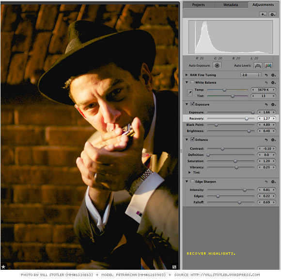
Step 7 – Apply Recovery
Dialing up Recovery has brought the blown highlights into control, while not really affecting much else. The final photo is a bit on the bright side in Petrarcha’s face, but with the positioning on the background, helps separate him and bring the viewer’s eye to his face.
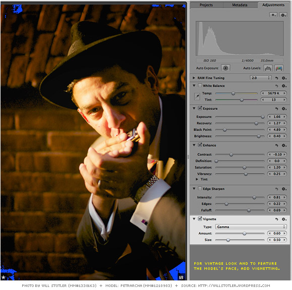
Step 8 – Vignette for Emphasis
Adding some vignetting adds to a “vintage” feel whether the viewer knows what “vignetting” is, or not—it’s recognized in photos from the timeframe. It also drops the edges of the photo into darkness, further accentuating Petrarcha’s face. The photo is finished.
Here’s the “before and after” example again:
When to Use This Technique?
This “underexpose deliberately then develop to bring up darkness” technique is appropriate for night shooting, where you position your subject in a very bright source of light surrounded by dimness or darkness. Or, with very bright sunlight and shooting appropriately. Or, in situations where you have a bright light and a backdrop that is very dark. It assumes you don’t mind shadows and I don’t mind them at all—they help make the subject appear more three dimensional and add interest/mood if used correctly. Positioning of the subject so the features are highlighted by the light (or concealed) while aiding your composition is a must—done well it becomes almost cinematic in appearance.
A Note on Workflow
In terms of overall workflow, I developed this one photo in less than three minutes. (The final settings—and the order in which they were used—are shown above, but I did tweak each slider a bit back and forth as I went to zero in on what was needed to get the result.) I then used the Lift and Stamp tool to push those settings to all other shots taken at the same time, in the same light. About 20 other photos. Each of those other photos required examination and tweaking depending on their particular situations, but I didn’t have to repeat the process of manually developing 20 photos. This is, in my opinion, a good way of working. But, it does presume that you know what you’re trying to get when you shoot. (These photos could have been unusable if I had shot them differently on location.) You can learn more about efficiencies of a high-throughput workflow in the “Post-Processing: Workflow” post.



Leave a comment